To create a graph start the rhino-stats client in graphical mode using the -g option:
$ ./rhino-stats -g
Graphing options
When run in graphical mode, rhino-stats offers a range of options for interactively extracting and graphically displaying statistics gathered from Rhino, including:
-
counter/gauge plot — displays the values of gauges, or the change in values of counters, over time; displays multiple counters or gauges using different colours; stores an hour’s worth of statistics history
-
sample distribution plot — displays the 5th, 25th, 50th, 75th and 95th percentiles of a sample distribution as it changes over time, either as a bar-and-whisker type graph or as a series of line plots
-
sample distribution histogram — displays a constantly updating histogram of a sample distribution in both logarithmic and linear scales.
Quick graph
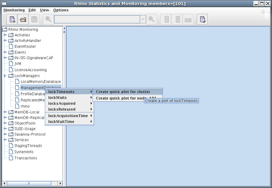
The client includes a browser panel at left, with the available parameter sets displayed in a hierarchy tree.
To quickly create a simple graph, right-click a parameter set, and select a parameter and type of graph.
For example, the following illustration shows selecting a quick plot of lockTimeouts:
Complex graph
To create more complex graphs, comprising multiple statistics, use the "graph creation wizard". The following steps are illustrated with an example that creates a plot of event-processing counter statistics from the IN-SIS.
1 |
Start the wizard
The wizard presents a selection of graph types. 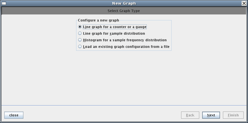
The following types are available:
|
||||||||||
|---|---|---|---|---|---|---|---|---|---|---|---|
2 |
Select statistics
The wizard presents a selection of graph components. 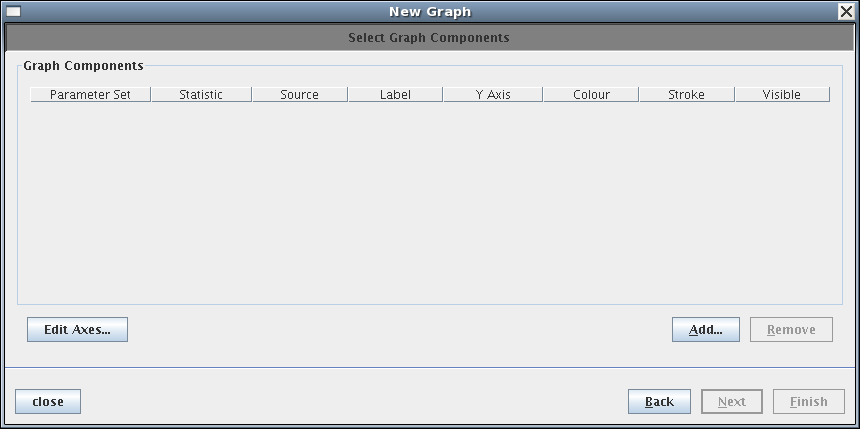
This screen displays a table of statistics selected for the line plot. Initially, this is empty. To add statistics, click Add. |
||||||||||
3 |
Select parameter sets
The Select Parameter Set dialog displays. 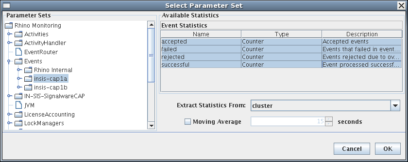
|
||||||||||
4 |
Select colours
The Select Graph Components screen redisplays with the components added. 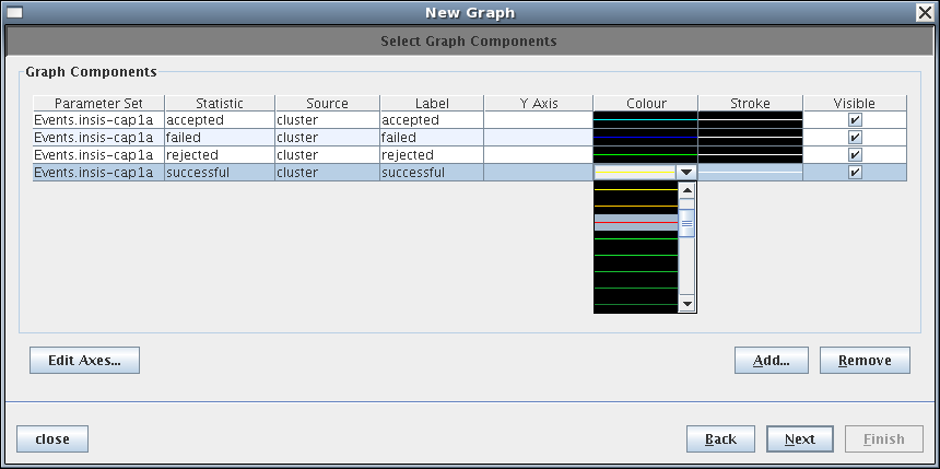
|
||||||||||
5 |
Name the graph
The wizard prompts you to name the graph. 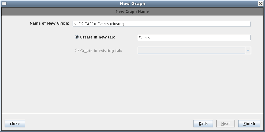
|
||||||||||
6 |
View the graph
The client creates the graph and begins populating it with statistics extracted from Rhino. 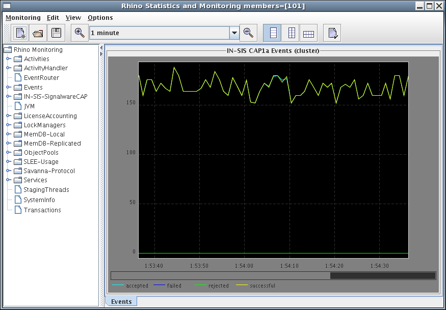
The client will continue collecting statistics periodically from Rhino and adding them to the graph. By default the graph will only display the last one minute of information. This can be changed using the timescale drop-down list on the toolbar or clicking the magnify or demagnify buttons either side of the drop-down list — the x-axis scales from 30 seconds up to 10 minutes. Each line graph stores approximately one hour of data (using the default sample frequency of 1 second). To view stored data that is not currently visible in the graph window, click and drag the scrollbar underneath the graph, or click directly on a position within the scrollbar. |
